Continuum Clock
Not science. A collaboration with the designers Harish Persad and Yoni, who had an idea for a clock and needed someone to make it run.
The idea: stop drawing the hands as objects on a face, and make them the entire display. Each hand is a conic gradient sweeping out from the centre, so the screen is divided into wedges that rotate through the day. There is no dial, no numerals and no tick marks. You read the time from where the boundaries fall, the same way you read a wall clock without ever looking at the numbers.
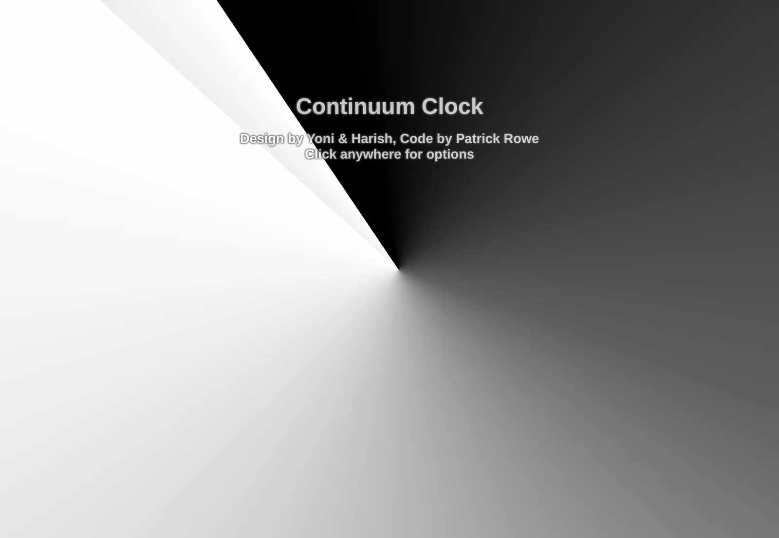
The default palette, which is monochrome. Click anywhere on the live version and the controls appear: leading and trailing colour for each hand, and a slider for how far around the face its gradient reaches. The sliders are miniature clock hands, which is Harish’s detail and the best one in the interface.
Building it
Plain HTML, CSS and JavaScript. No framework, no build step, no dependencies. The whole thing is five files and it loads instantly. Time comes from the client, so there is no server involved at any point.
The interesting problem was colour rather than time. Two hands, each with its own two-colour
gradient, overlapping and rotating past one another: what happens where they cross decides
whether the thing looks deliberate or muddy. Rather than pick one answer, the controls expose
CSS’s blend modes directly, fourteen of them from multiply through to luminosity, and you
can watch the same clock go from soft to harsh by changing one setting.
The rest was the ordinary work of making a design real: matching the gradient extents to what the designers had drawn, keeping it legible from across a room, and making it survive being resized from a phone to a television.
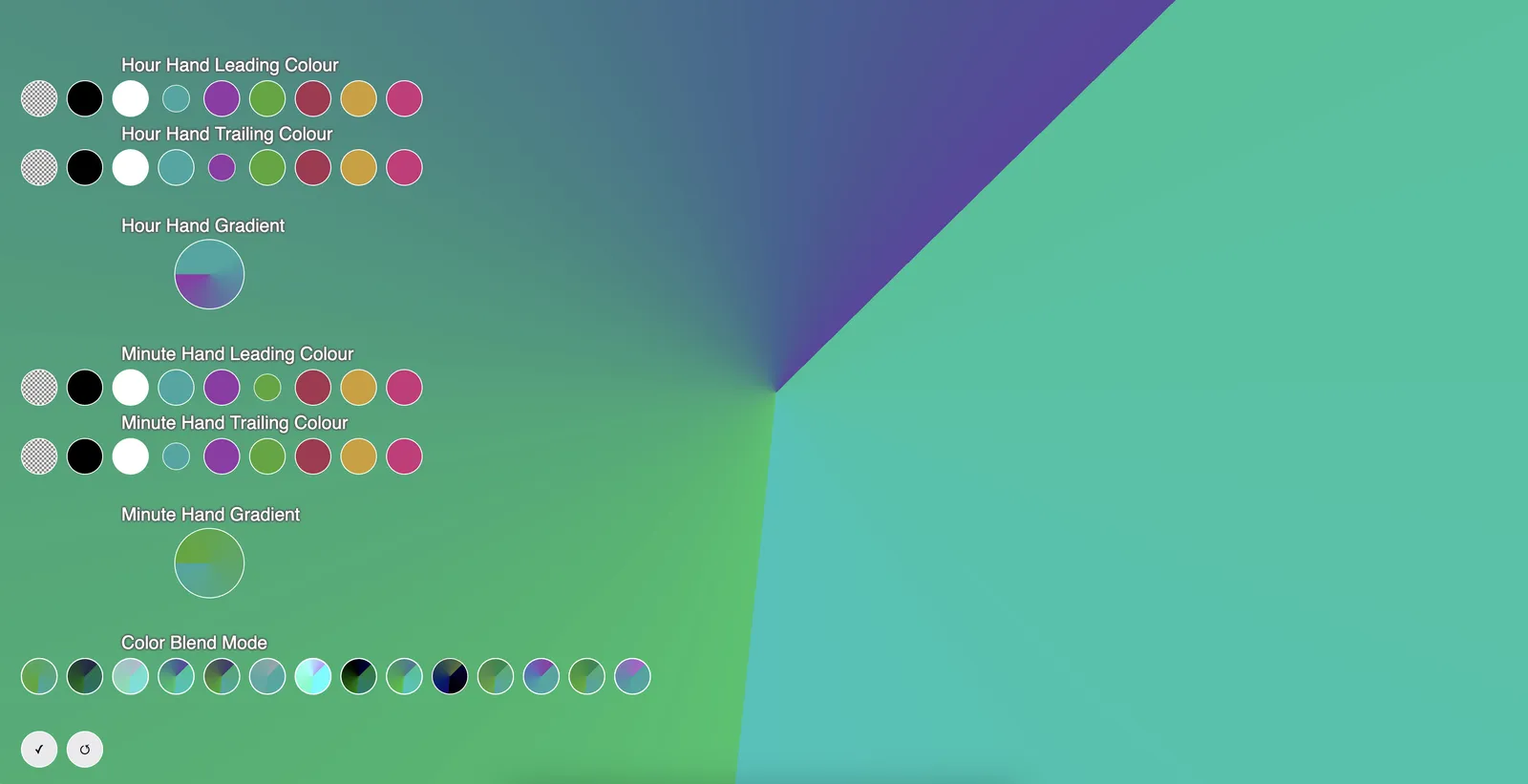
The controls, which appear on a click anywhere. Leading and trailing colour per hand, a gradient extent slider for each, and the blend mode row along the bottom. The sliders are miniature versions of the hands they control, so the thing you are adjusting and the control you adjust it with are the same shape. Own work, from the project repository.
Credits
Design by Yoni and Harish Persad. Code by me. The canonical version lives at harishpersad.com/TimeContinuum; the copy here is the same application, hosted so that the link on this page never goes stale.